Learn how to select date ranges and compare your data across different time periods.
The date picker lets you control which time period you’re viewing across all reports. You can also compare periods to spot trends and measure growth.
Selecting a date range
Section titled “Selecting a date range”Click the date picker in the dashboard header to choose your time period.
Preset options:
- Today
- Yesterday
- Last 7 Days
- Last 30 Days
- Last 90 Days
- Last 12 Months
👉 Note: Preset ranges end on yesterday (the most recent full day of data), not the current day. To include today’s data, select “Today” or use a custom range.
To select a custom range, click Custom Range at the bottom of the date range column. This opens a calendar where you can pick a start date and end date. Your selected range applies to all reports on the dashboard.
Comparing dates
Section titled “Comparing dates”To see how your metrics have changed over time, you can compare your current date range against a previous period.
When you open the date picker, you’ll see two columns: Date Range on the left and Compare To on the right. By default, comparison is set to No Comparison.
To enable a comparison, select one of the options in the Compare To column:
- Previous Period (match day of week): Compares to the same days of the week in the prior period. Monday compares to Monday, Tuesday to Tuesday, etc.
- Previous Period: Compares to the immediately preceding period of the same length.
- Previous Year: Compares to the same dates one year ago.
- Custom Range: Opens a calendar where you can select any date range to compare against.
Click Apply to update all reports, or Cancel to discard your changes. To turn off a comparison, select No Comparison and click Apply.
👉 Note: “Match day of week” is useful when traffic varies by day of the week. For example, if your B2B site is slower on weekends, comparing Mon–Fri to Mon–Fri avoids skewed results from weekend days.
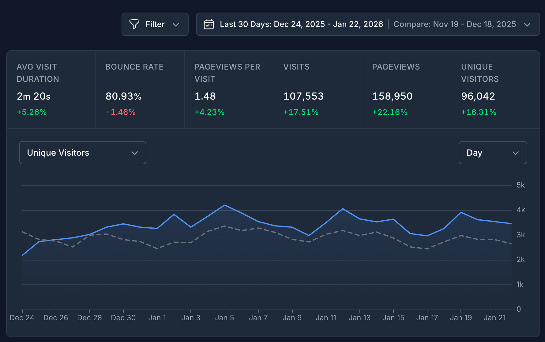
What changes when comparing dates
Section titled “What changes when comparing dates”When a comparison is active, you’ll see changes throughout the dashboard:
Line chart: A dashed gray line appears showing the comparison period alongside your current data.
Metrics: Each metric displays a percentage showing the increase or decrease compared to the prior period. Green indicates growth, red indicates a decline.
Hover details: Hover over any metric or table row to see the full breakdown — including the exact values for both periods and the percentage change.
Comparison options explained
Section titled “Comparison options explained”| Option | How it works |
|---|---|
| No Comparison | Disables date comparison. This is the default. |
| Previous Period (match day of week) | Shifts back by full weeks so weekdays align. Best for consistent week-over-week comparisons. |
| Previous Period | Shifts back by the exact number of days in your selected range. |
| Previous Year | Compares to the same calendar dates one year ago. Great for seasonal analysis. |
| Custom Range | Choose any date range manually. Useful for comparing specific campaigns or events. |
👉 Note: If a comparison option is grayed out, it means there’s no data available for that period yet.